Monday, September 20, 2010

Eyes and Ancient Egypt meets deco ...

Common themes in deco:


So what distinguishes this style from all of the rest? Basically it was a "modernization" of many artistic styles and themes from the past. You can easily detect in many examples of Art Deco the influence of Far and Middle Eastern design, Greek and Roman themes, and even Egyptian and Mayan influence. Modern elements included echoing machine and automobile patterns and shapes such as stylized gears and wheels, or natural elements such as sunbursts and flowers.


As i am a big fan of everything about ancient culture and art, especially ancient Egypt, I find myself really drawn to this meeting of styles.
The eyes of the god Horus are recognisable as prominent symbols of ancient Egypt, so perhaps echoing the stylisation of the eyes around this somewhat in my design would work well...? So ... My 3 main graphic design influences for my project so far are Art Deco, Spanish style and colour (and flamenco), and ancient Egyptian art. These three design elements are to be used now to create logo ideas, which I have decided to draw by hand and transfer electronically later.

Napier, NZ, an Art Deco town.


"a small New Zealand town that seems sometimes fictional"

Far from the world's great population centres and from the European and American cities where 20th Century design evolved lies a small city that is unique. Napier, New Zealand, was rebuilt in the early 1930s following a massive Richter 7.8 Earthquake. Subsequent fires destroyed most of its commercial heart. By the end of the decade, Napier was the newest city on the globe.

Nowhere else can you see such a variety of buildings in the styles of the 1930s - Stripped Classical, Spanish Mission, and above all Art Deco, the style of the 20th Century - in such a concentrated area. And Napier's Art Deco is unique, with Maori motifs and the buildings of Louis Hay, admirer of the great Frank Lloyd Wright.

Enhanced by palms and the angular Norfolk Island pines which are its trademark, and bounded by fertile fruit and grape growing plains, dramatic hills and the shores of the South Pacific, beautiful Napier is the centre of the Hawke's Bay region. In Napier, you can enjoy the legacy of its brave rebuilding and savour the spirit of the optimistic Art Deco era.

The Art Deco style was at the height of its popularity for buildings in 1931. Its clean simple lines and base relief decoration suited the needs of the new city...

Art Deco was fashionable. With its past destroyed, Napier looked ahead and chose a style associated with Manhattan, the movies and modernism.
Art Deco was safe. With its emphasis on low relief surface decoration, Art Deco forsook the elaborate applied ornament that had fallen from the buildings in the earthquake and caused so many deaths and injuries.
Art Deco was cheap. Its relief stucco ornament was an economical way to beautify buildings during the low-point of the Great Depression.

Other architectural styles for the period were also used - the Spanish Mission style from California, and both Stripped Classical and Classical Modern, the styles of Greece and Rome but simplified and modernized. And local architect Louis Hay's work strongly reflects Frank Lloyd Wright's Prairie Style inthe United States mid-west, which developed in the early years of the century.


http://www.artdeconapier.com/default.aspx

Wednesday, September 15, 2010

Logo design ...

The main parts to my business logo will be the name 'SPANISH EYES', in my selected deco font, plus an image that evokes my desired aesthetic. I feel a set of stylised eyes that follow the deco style would be very effective, and convey the notion that this is a space to look, to observe, to watch, and also be seen.


I am going to take the eyes from this poster and start playing around with stylising them and adding a deco Spanish flavour incorporating style elements I have been researching ...

A fan will definitely be part of the design, and an immediately reconisable iconic flamenco style dress. The distictly Spanish colour scheme of scarlet red and yellow will definitely be combined with the strong black straight lines and curves of the art deco movement.

Wednesday, August 25, 2010

Indesign font exercise:

Font ...

 I have decided on a deco font called odalisque. It has that distinct art-deco style with bold lines combined with distinct decorative curves.

 Art Deco. Hedonism. Glamour. Luxury:

Art Deco Style is one of the most influential design movements of the 20th Century.
Although it was considered to be highly functional, it emerged as a purely decorative style, meaning that it's primary purpose was to be beautiful and ornamental. But more than an artistic-style, it has evolved to represent a particular lifestyle, an attitude towards life. It evokes images of nonchalant Wall Street suits leaning against a slick Manhattan bar, with a cigar in one hand and a slinky, red lipstick'ed blonde, dripping diamonds, in the other.

Or imagine the French Riviera, circa 1929 - real-live pin-up girls lounging around in candy-coloured bathing suits, fawning over the muscled beefcake keeping guard on the beach.
The Art Deco Style insinuates a lifestyle of pleasure, leisure, excess and all-out glamour.
Architecture, Interior & Graphic Design, Jewelry and Fashion in the 1920's and 1930's were all given a glamour-injection thanks to the Art Deco movement.

In recent years, this ultra glamorous style has seen a massive resurgence. So many of today's condos, hotels, nightclubs and restaurants have been 'art-decofied'. The world of fashion and jewellery has also jumped on the bandwagon.
But as the world tries to grapple with the doom and gloom of a global recession, our fascination with such a non-practical, hedonistic style seems, umm how can I say this politely? - out of whack.
Yet, it's precisely this swing towards prudence and thrift that makes us crave extravagance and superfluous luxury all that much more.


Art deco fonts:
If Art Nouveau was about finding beauty in organic intricacy, Art Deco was perhaps about finding beauty in geometric simplicity. First appearing in the 1920s and 30s, Art Deco made a comeback in the 1970s and 80s as well.
Almost by definition, Art Deco meant sans serif type. The most common such face is Avant Garde (1974, Lubalin), which is striking but hard to read at length. A more graceful geometric sans is Futura (Renner, 1927-39). There are also more quirky faces in this category, such as Kabel (Koch, 1927-30). A recent popular Art Deco display face is ITC Anna (1991?).

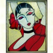
Examples of deco graphic design:


History of the name 'Odalisque': An odalisque (Turkish): Odalık) was a female slave in an Ottoman seraglio. She was an assistant or apprentice to the concubines and wives, and she might rise in status to become one of them. Most odalisques were part of the Imperial Harem, that is, the household of the sultan.

(Jean-Auguste-Dominique-Ingres, La Grande Odalisque, 1814)

Odalisque:

Name decision.

I've decided on borrowing 'Spanish eyes' (from the arcade machine) as my business name. There is a song too, (see lyrics below) originally sung by Al Martino, and covered by a number of other artists such as Elvis Presley, U2, Faith no more, Englebert Humperdink, amongst others.

Therefore it will have an association and a memory for many people in cultural consciousness, as well as having an air of mystery that will make people wonder what the business is. Though I may need to include a sub-title if I am going to be less obvious. It fits with the mood I want to create, and will go very nicely with the European art deco styling that I desire, the dancing aspect. The word 'eyes' also fits in well for the gallery aspect as we view with our eyes.

Lyrics

Blue Spanish eyes teardrops are falling from your Spanish eyes
Please please don't cry, this is just adios and not good-bye
Soon I'll return, bringing you all the love your heart can hold
Please say "Si Si" say you and your Spanish eyes will wait for me

Blue Spanish eyes prettiest eyes in all of Mexico True Spanish eyes

Soon I'll return, bringing you all the love your heart can hold
Please say "Si Si" say you and your Spanish eyes will wait for me
Say you and your Spanish eyes will wait for me

Wednesday, August 18, 2010

Aesthetics ...

I fell in love with Melbourne's art deco edge when I first moved here. I think it is something that everyone who lives in Melbourne can relate to, has an attachment to, memories of, etc ... I feel like the art deco aesthetic will work well for my concept as it has connotations of style, flair, being cosmopolitan, looks great in a cafe/bar setting.


Art deco cafe
I really like the pattern on the bar. Something similar would work really well in a logo/promo material.

Because a big feature of the space is going to be the dance classes I feel like a bit of a European flavour could be appropriate. Warm colours. Spanish style colours, terracottas, reds, yellow ...

This arcade game design has a great colour scheme. I like the name Spanish eyes too ... Hmmm

Wednesday, August 11, 2010

Ideas... Influences ... Brain-storming ... Name-storming.

For concept gallery/bar/activity space ...


The space will be multi-functional as a gallery space, a bar or cafe/bar, and also host other activities such as various art workshops, dance performances and lessons, music performances and lessons, and more ...


My fantasy situation for the sake of my design brief is that it is a group of people, a collective come together from different industries to share a space that creates something different. A beautiful art deco style building has been bought in the inner suburbs of Melbourne and the next stage is to begin the design concept for the business.


The blog in itself has a design brief in that it be a tool for the collective to view the project's process and give ideas, comments and feedback by subscribing to the blog.


Similar things out there: http://www.facebook.com/group.php?gid=7002696964

 Hopkinson Gallery, studios and Tea bar , The Art Organisation Nottingham: (from my hometown nonetheless) has similar elements as I'd like to incorporate into my concept. They also have a range of activities the space is used for, such as Yoga, life-drawing and pole dancing (!)


Listings for life-drawing classes at various venues:
http://www.courses.com.au/Category/creative_arts/life_drawing_classes/

I do realise that the idea of having a bar alongside a place of learning/creating could be seen as controversial, but I think there could be a balance reached where the bar is perhaps not always open, is shut while there are activities on. Obviously certain activities, such as samba classes would match perfectly with the bar, as after class finishes the class can have a few drinks, do some socializing and practice more of their moves.


  • (3in1)
  • The sumthin' sumthin' gallery
  • gallery+
  • More than just a gallery
  • Your gallery space
  • Your space
  • Open space
  • The Melbourne multi-functional gallery space
  • Ace space
  • The ace of spaces
I want the concept to appeal to a wide range of the community, and of all ages (over 18 years of course as were dealing with a licensed premise). As there will be lots of different activities/different types of artists/event/music etc ... etc ... I want to appeal to as wider range of people as possible in the aesthetics. Perhaps the design for promotional material could be a composition of the business logo and the event could have its own space which could be targeted style wise to different audiences/demographics.


Inspirational images for gallery/bar/activity space ...